White ink is easy to overlook in a color-management workflow. In many packaging and specialty-printing applications, it is treated as little more than an underbase—a supporting layer printed beneath the colors people actually see. But white ink is not just background. It plays a direct role in how color appears, how it is measured, and how consistently it can be reproduced.
For printers working with clear film, metallic materials, colored papers, plastics, textiles, corrugated board, or other nonwhite substrates, the white ink layer often becomes the foundation of the entire printed image. Its opacity, thickness, uniformity, and color can all influence the appearance of the inks printed above it. The effect also depends on how the package is constructed. White ink behaves differently in a surface-printed application than it does in reverse printing, where the image is viewed through a transparent film. That makes white ink a true color-management variable rather than simply another ink station on press.
Creating a New Printing Surface
Most conventional color-management workflows assume that ink is being printed on a reasonably white and uniform substrate. The paper or other material reflects light through the ink, helping create the color the viewer sees. That assumption falls apart when the substrate is transparent, metallic, brown, brightly colored, or unusually dark. In those situations, white ink is often used to create a neutral foundation for the process colors. Instead of allowing the image to interact directly with clear film or colored material, the white layer reduces the substrate’s influence on the final appearance. In effect, white ink becomes part of the printing surface.
This is important because any change in that surface can change the final result. Even when cyan, magenta, yellow, black, or expanded-gamut inks remain stable, a change in white ink can affect the brightness, saturation, neutrality, and overall appearance of the finished print.
A profile or calibration built using one white ink condition may not perform the same way if the white formulation, laydown, curing, opacity, or print sequence later changes.
Surface Printing and Reverse Printing
The role of white ink cannot be fully understood without considering whether the job is surface printed or reverse printed. In a surface-printed application, the inks are applied to the outside surface of the material and are viewed directly. On a clear or colored substrate, white may be printed first as an underbase, followed by the process and spot colors. The viewer sees the colored inks without looking through the substrate.
A typical surface-print sequence on clear film might be:
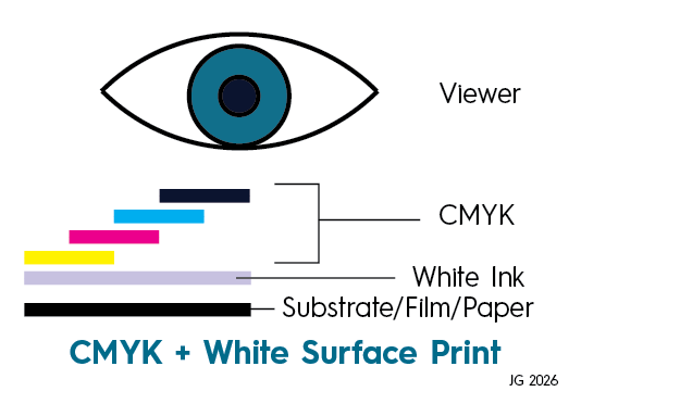
Example: Film → White ink → Process and spot colors → Viewer
In this construction, the white ink is physically beneath the colored image. It provides the reflective foundation for the inks printed over it and masks the film, container, product, or background behind the package. Surface printing leaves the ink exposed unless a protective coating, varnish, or laminate is added. As a result, gloss, surface texture, abrasion resistance, curing, and the interaction between the white and overprinted colors can all influence the finished appearance.
Reverse printing uses a different construction. The image is printed on the inside of a transparent film and viewed through the film from the opposite side. The color sequence is normally printed in reverse order, with the process and spot colors printed first and white ink applied afterward.
An example of a reverse-print sequence might be:
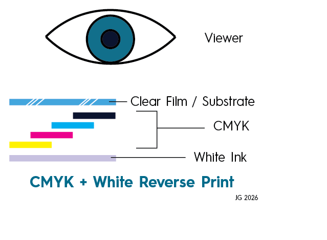
Example: Viewer → Clear film → Process and spot colors → White ink → Laminate, adhesive, product, or background
Although white is printed last on press, it still appears behind the colored image from the viewer’s perspective. It acts as the reflective backing for colors that are viewed through the clear film.
This distinction matters because the film itself becomes part of the optical system. Its clarity, thickness, gloss, haze, color, surface treatment, and refractive characteristics can affect the appearance of the image. The film may increase gloss and apparent color depth, but it can also slightly shift measured and perceived color.
The same inks printed with the same nominal values may therefore look different in surface and reverse constructions.
Why the Print Sequence Matters
Just like when children color with crayons or markers, the order matters. For example, when using a light color marker on top of a darker color, the lighter color will be contaminated by the darker color. Color order matters. In surface printing, process colors are deposited onto the white ink. Their trapping, density, dot formation, and adhesion depend partly on the condition of that white layer. If the white ink is too smooth, too rough, insufficiently cured, or chemically incompatible with the next ink, the colors printed over it may not transfer as expected. This can lead to uneven solids, poor adhesion, reduced density, or unexpected color shifts.
In reverse printing, the process colors are usually printed directly onto the clear film before the white ink is applied. The white must then trap over the colored inks without disturbing them. Its ability to cover those inks uniformly, adhere correctly, and withstand lamination becomes critical. The viewing order is also different from the printing order. Because the finished image is viewed through the film, separations, trapping, text, and artwork must be prepared for reverse orientation.
Color-management data should therefore be created for the actual print sequence. A characterization produced for surface printing over white should not automatically be used for a reverse-printed construction, even when the same substrate, white ink, and process inks are involved. The optical path and ink interactions are different.
Why Opacity Matters
The primary job of white ink is usually to hide what is underneath or behind the printed structure. On clear packaging film, an opaque white layer prevents the contents of the package or the background behind it from showing through the graphics. On metallic material, it can block the reflective surface and create a more conventional printed appearance. On kraft board, colored paper, or dark plastic, it reduces the influence of the substrate color.
When the white ink is not opaque enough, the substrate or package contents continue to affect the image. A brown material may make colors look darker or less saturated. A metallic substrate may add shine or brightness. A colored plastic may shift the hue of process and spot colors. On clear film, the appearance may change depending on what product, label, container, or background is placed behind it.
This can lead to a frustrating situation in which the press appears stable and the process-color measurements are within tolerance, but the finished package still looks inconsistent. The problem may not be the color inks at all. It may be the amount of the background showing through the white layer.
In a reverse-printed package, inadequate white opacity may be especially noticeable after lamination or filling. A package that looks acceptable over a white inspection table may change dramatically when placed against a dark adhesive, printed secondary layer, colored container, or the actual product.
Opacity can be evaluated by comparing the same printed white sample over black and white backgrounds. If the appearance and measurements change significantly between the two, the white ink is not fully masking what is behind it.
The goal is not necessarily perfect opacity in every application. Some designs intentionally use transparency, metallic effects, or interaction with the substrate. The key is to define the intended result and control it consistently.
Ink Film Thickness Changes Color
Opacity is closely connected to ink film thickness. In general, applying more white ink creates a thicker layer and improves hiding power. However, more ink is not always better.
The amount deposited depends on the printing process. In flexography, it may be influenced by anilox volume, ink viscosity, plate characteristics, impression, press speed, and ink transfer. In inkjet, it may depend on drop volume, resolution, pass count, nozzle performance, and print mode. In screen printing, mesh, stencil thickness, squeegee pressure, and ink rheology all affect the deposit.
If the white layer is heavier than the condition used during profiling, it may create a brighter and more opaque foundation. The printed colors may consequently appear cleaner, lighter, or more saturated. If the layer is thinner, more of the substrate, product, adhesive, or background may influence the result. The same colors may appear duller, darker, or shifted in hue.
A thicker layer can also create production problems. Too much white ink may lead to poor curing, cracking, blocking, adhesion failures, excessive surface texture, reduced flexibility, or difficulties during lamination and finishing.
In reverse printing, an excessively heavy white layer can affect bond strength and lamination performance. It may also trap residual solvent or interfere with adhesive compatibility. In surface printing, it may affect the smoothness and transfer of the colors placed over it.
The objective is not to print the maximum amount of white ink possible. It is to establish a repeatable, consistent film thickness that delivers the required opacity and appearance without creating other production problems.
Uniformity Is Just as Important
Average opacity alone does not tell the full story. A white ink layer may meet its average target while still containing streaks, pinholes, mottling, banding, weak areas, or side-to-side variation. Once process colors are combined with that white layer, these inconsistencies may become even more noticeable.
For example, a uniform blue printed with an uneven white backing may appear lighter in one area and darker in another. A neutral gray may look clean in one location and slightly colored in another. A brand color may fall in and out of tolerance across the same package.
Because the white is positioned beneath the finished image, the variation may initially be blamed on the process colors, separations, profile, or press calibration. That can lead production teams to correct the wrong part of the workflow.
White ink should therefore be evaluated not only for its average opacity but also for its uniformity across the sheet, web, or image area. Measurements should be taken in multiple locations, especially where recurring press variation is known to occur. An inconsistent white backing will lead to visual inconsistency, allowing the product or surface to show through. Visual inspection is important. Pinholes, streaks, and mottling may not always be captured by a single numerical reading.

White ink laydown. Mottled (left) versus Smooth (right).
Measurement Backing Changes the Result
Measurement backing is another critical factor when evaluating white ink and the colors associated with it.
Transparent and translucent samples can produce different measurements depending on what is placed behind them. The same patch may measure differently over a white backing, black backing, product-colored backing, or no controlled backing at all.
A white backing may represent a label applied to a white container. A black backing can reveal insufficient opacity or show-through. A backing matched to the product or final package may better represent actual use.
There is no single backing that is correct for every application. What matters most is that the measurement condition is clearly defined and used consistently.
Surface-printed and reverse-printed samples may also require different handling. A reverse-printed film should be measured from the side through which the consumer will view the finished image. Measuring directly against the ink side can produce results that do not represent the final package.
Lamination adds another variable. The adhesive, secondary film, and final structure may change gloss, clarity, and color appearance. Measurements taken before lamination may not agree with measurements of the finished package, even when the inks have not changed.
If characterization data were created over a white backing but production samples are verified over black, the reported difference may be caused by the measurement setup rather than an actual press change. The same problem can occur when one department measures a single layer of film while another folds the sample or stacks multiple layers.
A documented procedure should identify the backing, number of layers, viewing side, sample orientation, instrument settings, aperture, measurement condition, and whether the sample is evaluated before or after lamination. Without that consistency, measurement data can create more confusion than clarity.
The Effect on Overprinted Colors
White ink does more than cover the substrate. It also influences the way the other inks develop and appear. Two white inks may look similar by themselves but produce noticeably different finished colors. One may be warmer or cooler. One may reflect more strongly in certain parts of the visible spectrum. One may have a glossier or rougher surface.
These differences can influence neutrals, pastels, skin tones, spot colors, and saturated process colors.
In surface printing, the process colors physically overprint the white layer, so its texture, curing, and surface energy affect ink transfer and trapping.
In reverse printing, the process colors are generally printed before the white. The white ink changes their appearance by providing the backing through which light is reflected. It can also affect the apparent depth, saturation, and contrast of the image when viewed through the film.
This is why profiling and characterization should use the actual production construction. The substrate, viewing direction, white ink, laydown, curing settings, ink sequence, process colors, coatings, adhesive, and lamination should match the intended finished package as closely as possible. A characterization chart printed as a surface construction cannot reliably predict a reverse-printed and laminated result.
Controlling White Ink Like a Process Color
The most effective approach is to treat white ink with the same discipline applied to the other production colors. That begins with defining an aim. Depending on the application, the target may include opacity, CIELAB values, spectral reflectance, density, gloss, film weight, thickness, or uniformity.
The production team should also define whether the condition is surface printed or reverse printed. Print sequence, viewing direction, backing, lamination, and final package construction should be included in the specification.
White ink control patches can be added to press sheets or control strips where practical. Operators should evaluate the white layer at the stage where it can still be isolated from the rest of the image. Monitoring may also include viscosity, temperature, agitation, circulation, filtration, anilox condition, nozzle performance, curing energy, surface treatment, and lamination performance.
Significant changes should trigger a review of the color condition. These may include a new white ink formulation, different anilox, revised print mode, new substrate, altered curing settings, different surface treatment, changed film thickness, or a switch between surface and reverse printing.
These are not minor production adjustments. They can change the effective printing surface, the optical path through the package, and the colors that can be reproduced.
White ink may sit behind the image in the finished construction, but its influence is visible throughout the package. It controls how much of the substrate or product is hidden, how light is reflected through the printed structure, how process and spot colors develop, and how closely measurement data matches visual appearance.
When white ink is controlled as part of the color-management system rather than treated as an afterthought, printers gain a more stable foundation for predictable production. The result is better color consistency, faster troubleshooting, fewer surprises, and a finished product that more reliably matches the approved expectation.
To learn more about managing print production visit www.ilearningplus.org. iLEARNING+ provides free resources to the industry, like those tools and targets developed by the Print Properties Committee, along with industry-recognized training and certification available only from PRINTING United Alliance.