Reproducing color accurately in print isn’t an option — it’s an expectation. It begins with capturing the image, followed by color adjustments and correction. Visually assessing color can be difficult for those without formal color training. Successful color correction adheres to three color reproduction requirements as a guide and foundation for making accurate adjustments.
Before we talk about visually assessing color, a few assumptions must be made. The first assumption is that you’re not color-deficient. This can be verified with one of the many color deficiency tests available.
The second assumption is that you’re viewing color under controlled viewing conditions such as in a viewing booth or on a calibrated display.
Three Requirements
There are three key aspects of color image reproduction that must be considered for successful and accurate color reproduction: tone reproduction, gray balance, and selective color correction. If something is going to be wrong with an image from a color standpoint, it will be related to one, two, or all three of these factors.
Step 1: Is the tone reproduction accurate? Tone reproduction describes the relationship between the density of the original image and the halftone dot area of the reproduction. Another way to describe it is “contrast,” or the lightness and darkness of an image.
To visualize this concept, consider a black-and-white image. Since it contains only one color, tone reproduction is the only consideration. If tone reproduction is inaccurate, the image will show a loss of detail in the highlights or shadows, or appear to have poor contrast.
To correct tone reproduction, use either the Levels or Curves tools in Photoshop. Adjust all three channels (RGB) to ensure proper contrast in the highlight, midtone, and shadow areas of the image.
Step 2: Is the gray balance accurate? Gray balance refers to using cyan, magenta, and yellow printing inks to produce neutral gray. If the neutrals are faithfully reproduced, the other colors will also be rendered accurately. To reproduce a neutral gray, dot sizes are manipulated using Photoshop within the cyan, magenta, and yellow separations.
Poor color reproduction is typically attributed to gray balance, since the human eye is far more sensitive to color shifts versus changes in contrast. When gray balance is inaccurate, images will have a noticeable color cast and could appear too red, too blue, and so on.
A quick way to determine if an image has incorrect gray balance is to pinpoint neutral grays that may be contained within it. Avoid focusing on the saturated color areas. Neutral grays will cast one way or another if the gray balance is inaccurate, and it’s very apparent.
To correct gray balance, use either the Levels or Curves tools in Photoshop. Based on the image’s color cast, adjust the individual channels (R and/or G and/or B) to restore proper gray balance.
Step 3: Is selective color correction needed? Tone reproduction and gray balance need to be assessed and adjusted before color correction. However, even with precise tone reproduction and gray balance, achieving accurate hues and realistic color saturation requires compensation for the imperfections in the cyan, magenta, and yellow inks used in print reproduction. These imperfections, along with the substrate’s properties, will affect the reproduction of red, green, and blue hues.
To compensate, use the Selective Color tool in Photoshop. This tool will only affect the saturated colors within the image while leaving the neutrals untouched. The pulldown menu in the Selective Color palette lets you choose which color to adjust, while the cyan, magenta, yellow, and black sliders allow you to correct the selected color.
Summary
A methodical, consistent, step-by-step approach to assessing color images is key. Always look at tone reproduction first, gray balance second, and selective color correction third. Remember: Any issue with an image may involve one, two, or all three of these elements.
Want to learn more? Check out the eLearning course “Photoshop for Prepress,” at ilearningplus.org.
Joe Marin is senior vice president, member services at PRINTING United Alliance, through which he helps people learn, advance, and grow.
To learn more about training, e-learning courses, and other educational opportunities available to members for free or at a discounted rate, contact 888-385-3588 / membership@printing.org.
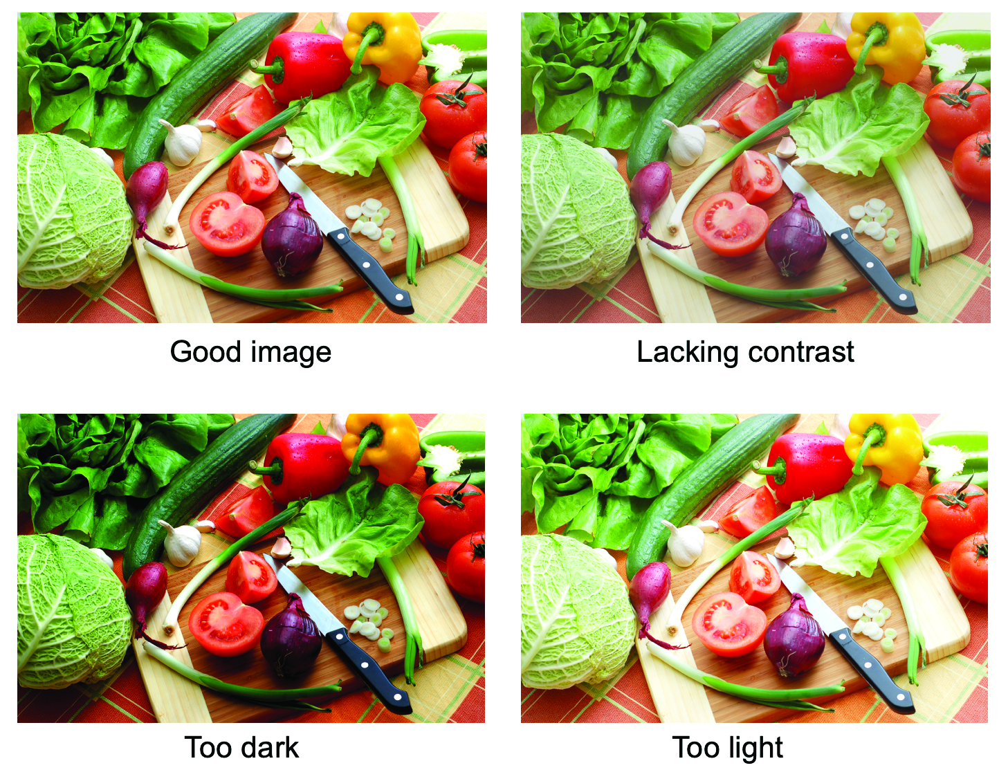
Caption: Example of an image with proper tone reproduction (top left) and poor tone reproduction (top right through bottom left). | Credit: PRINTING United Alliance
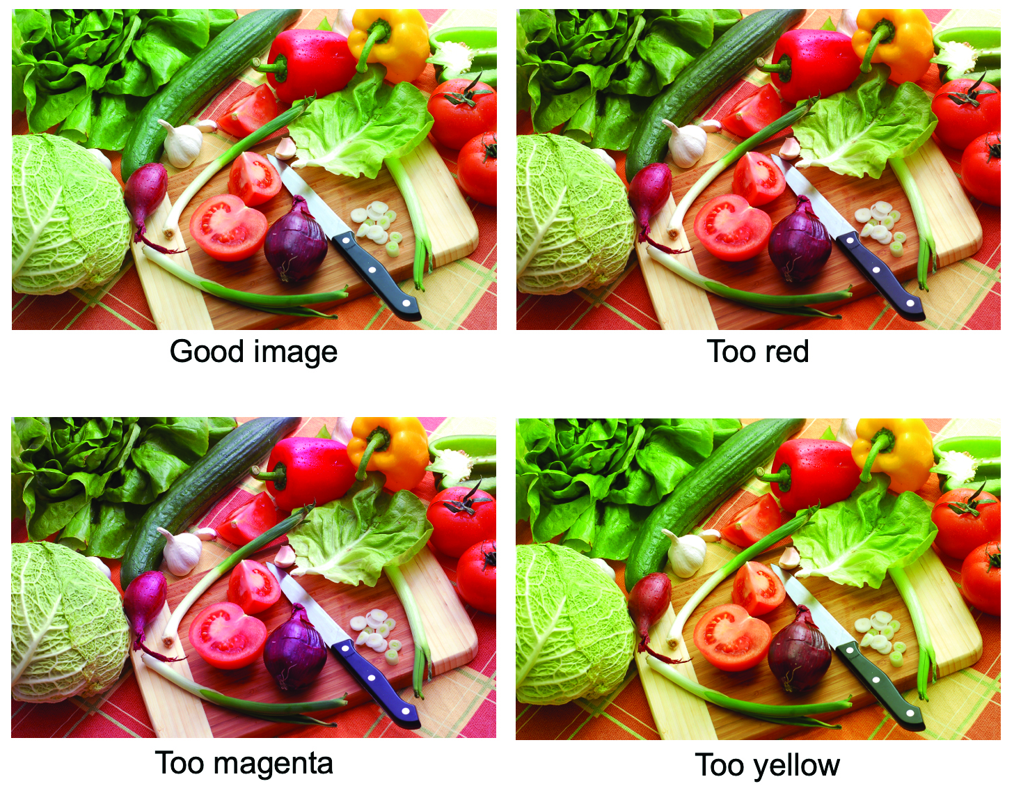
Caption: Example of an image with proper gray balance (top left) and poor gray balance (top right through bottom left). | Credit: PRINTING United Alliance
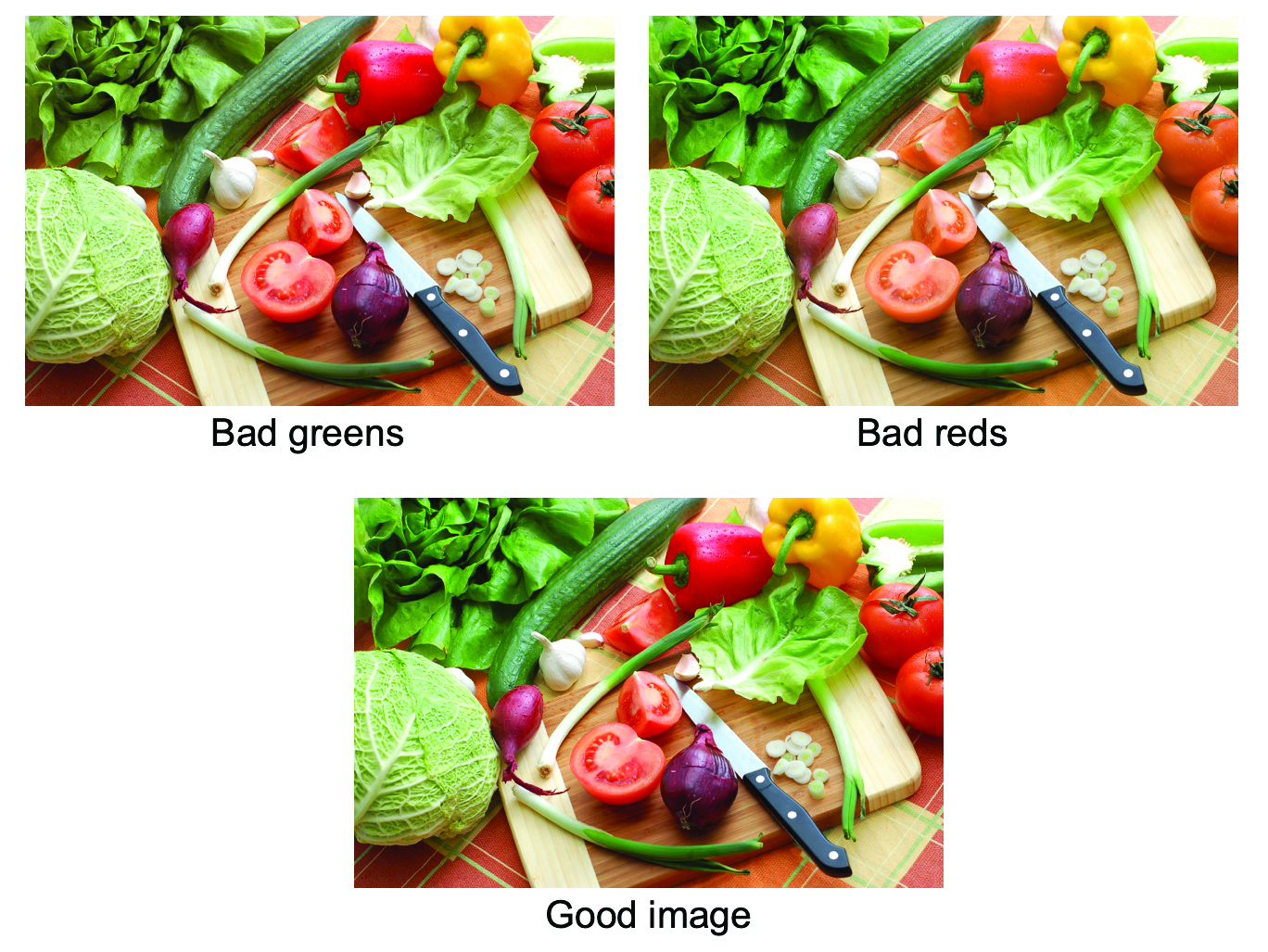
Caption: Example of an image without color correction (top left and right), and
with color correction (bottom). | Credit: PRINTING United Alliance