
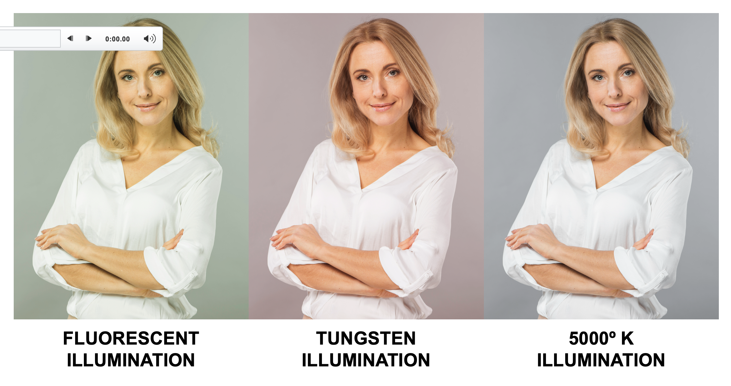
Since color is the reflection of light, then the kind of light in which color is viewed will dramatically affect our perception of it. Even though one light may appear “white,” it may contain slightly different wavelengths than another seemingly white light. To illustrate this phenomenon, The figure below shows the effects of the same subject when viewed under three different light sources.
The light under which we view color is a variable that can be controlled. Standardizing and controlling color viewing and proofing conditions can eliminate discrepancies in the color approval process and add consistency to color perception
and communication.
To reduce variables in the color communication process, the American National Standards Institute (ANSI) has specified viewing conditions for the graphic arts in ANSI PH2.30-1989. Other national (BS 950 in the United
Kingdom) and international (ISO 3664) standards are also in use, basically identical to the ANSI specifications.
The easiest way to achieve the recommended standard viewing conditions is by using a viewing booth, but the following recommendations
are basic:
• A 5,000° Kelvin light source (sometimes designated as D50), because this particular light source emulates daylight and contains equal wavelengths of RGB light. Manufacturers recommend changing the lamps after
2,400 hours of use because the color temperature changes as the lamps age.
• A 22–24° illumination angle for the light source to prevent glare.
• A warm-up time of 10–15 minutes so the lamps
can reach a stable temperature before color viewing takes place.
• Munsell N8/standard gray paint for the walls of the viewing booth to prevent adjacent colors from affecting color perception. Keeping the area inside and surrounding
the viewing booth clean and uncluttered is also helpful. Pictures, press sheets, posters, or other brightly colored material in or near the booth can affect color viewing. Even when observing color in a standard viewing booth, consider the color shirt
that you (or your client) may be wearing. A red shirt can reflect down onto the proof or press sheet, influencing color perception. Many printers paint the walls within the print shop this neutral gray color. You can purchase Munsell N8 gray paint
from Sherwin Williams (specify color code #2129 Zircom, flat paint).
Color judgments of photographic originals, color proofs, and printed samples play such a large part in print production that understanding how we perceive and reproduce
color is an essential aspect of the process. Even though color perception is as subjective — and sometimes arbitrary — as an opinion, color knowledge can help the customer and printer find enough common ground to facilitate color communication
and understanding.
Now that we’ve covered the foundations of color viewing considerations, explore how to view and collaborate more effectively with internal and external clients when it comes to color. Dive deeper and check out the
"How to Evaluate and Communicate Color" course on the Alliance’s recently launched iLEARNING+ e-learning platform.

Joe Marin is senior VP, education and training at PRINTING United Alliance, through which he pursues his passion helping people learn, advance, and grow. He has spent the majority of his career in the printing industry and is one of the leading voices on digital technologies, speaking at major industry trade shows and conferences on topics related to succeeding in a digital print environment.