In the first two parts of this series, we covered the roles of both the press and the proof in achieving a match with each other, along with the importance of basing your “stake in the ground” on a press (or printing condition) and selecting the right profile when producing a proof that will serve as an accurate representation of the result off the press. Both devices operate independently and with different control systems. But what's critical is that both devices, however they are set up and at whatever target they are shooting for, remain as consistent as possible. If either or both devices drift, or vary, too far away from their intended condition, you’ll be chasing your tail and the whole color reproduction process will be subject to chance. In other words, you will have challenges achieving a good match between the proof and the press on a consistent basis. This is where process control comes in and plays a vital role.
The good news about process control for printing presses and proofing systems is that it’s basically the same approach, just that what differs is how each device is adjusted or modified to achieve the target condition. In the case of printing presses (specifically conventional, or non-digital, ones like offset, flexography, gravure, and screen), adjustments to ink film thickness (or strength) and modifications to tone reproduction (dot gain or tone value increase (TVI)) via curves are the main adjustments you can make. And in the case of most — but not all — digital printing systems and proofing systems, color is controlled within the drivers and the color management system that controls the color (see Part 2 in this series).
At the end of the day, there are just a handful of attributes that need to be measured, monitored, and controlled to achieve a high level of color consistency. They include:
Color of the Solid Individual Primaries
Note the emphasis on “color” and no mention of “density.” This means utilizing colorimetry (L*a*b*C*ho) to quantify the color of the individual primary colors, or inks. Be it CMYK, spot colors, or expanded gamut (EG) primaries, quantifying and controlling the color of the individual primary solids is the first and most important piece of process control for consistent color reproduction. I like to say that if the color of your crayons is different, so will the color of your print!
Color of the Overprint Primaries
Just as color of the solid individual primaries is critical, so too is the color of any ink that overprints with another ink. In process color printing
(CMYK), we look at red, green, and blue (RGB) overprints as an indicator of how well and consistently the chromatic primaries (CMY) overprint with each other. The same goes for EG applications where the EG primaries overprint with their “process
color neighbors” (orange with yellow and magenta; green with yellow and cyan; and violet with cyan and magenta). All the wonderful colors that are achieved with color printing systems rely on the individual primaries printing well and consistently
with each other.
Tone Reproduction
This is the more academic term for dot gain, or TVI. Effectively, this is the control of the tonality of images and graphic elements that utilize some sort of screening, be
it halftone dots or stochastic spots. The key is that you need to have proper and consistent reproduction of tonality in order to achieve good color consistency.
There are other attributes you can measure and monitor, but the three listed above are the key ones. For example, gray balance is a great attribute to monitor (a la G7) and is a great indicator of the consistency of color reproduction, but you can’t directly adjust it like you can the solids and tone reproduction. When a deviation in the target gray is detected, the way it gets corrected is by adjustments to the solids, overprints, and/or tone reproduction. It’s more of an informative metric as opposed to a normative one, like the three above. But it’s still fine to include and monitor.
Different Processes, Different Approaches
When it comes to the individual applications, there are slightly different ways to approach each of them. In the case of the printing press, you should look to include some sort of control strip in a scrap area of the print. For sheetfed offset, that’s typically at the lead or tail end of the sheet. For web offset presses, it’s somewhere between pages or die positions (for packaging), where a color bar can be fit. In both cases, it’s critical that the color bar span the entire width of the form and that a solid patch of each individual solid primary is present for each ink key. This way, adjustments can be made effectively from actual data for each ink key. Tint patches of different levels (25%, 50%, 75%, etc.) and overprint patches can be sprinkled in where there is space, but are not needed for every ink key. And of course, other patches (gray balance, etc.) can be placed where possible.
For flexo, gravure, and screen printing, due to how the processes behave and are adjusted,
different arrangements of color patches can be utilized, but should still contain “the big three” as described above. It’s also common to place control patches in various scrap areas and even in the live graphics, where allowed.
Here is a portion of an example color control bar.

For proofing systems (which are typically inkjet these days) and most digital printing systems, the same patches are needed for effective process control, but the arrangement and quantity may be different. Focusing on proofing systems, there is no need to measure across the width of the sheet like in offset. And given the space usually afforded, it’s simplest and best to have just one set of color patches arranged together for simple measurement and evaluation. A great example of this is the freely available Idealliance 12647-7 Digital Control Wedge, as seen below.
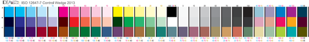
This control bar contains all the key solids, overprints, and tone reproduction patches, along
with gray balance patches and a variety of other CMYK patches that give an excellent assessment of the color reproduction of the proofing system. This “wedge,” or something like it, should be printed on every proof along with data showing
conformance to agreed-upon targets and tolerances. This verifies that the proof was made correctly and accurately to the target condition.
For both press and proofing applications, the key is to target the characterization dataset that came from
the press calibration activities (hopefully G7, but whatever print condition you determined), and was used to build the profile for proofing and any color conversions. That dataset ultimately serves as the one and only stake in the ground to target
for all devices (presses and proofers) that are expected to match each other. And using that reference data is what will drive your process control efforts toward success in matching color between devices, delivering consistency, and keeping you from chasing
your tail!
 As PRINTING United Alliance’s VP, Technical Services, Bill Pope leads educational initiatives, including the Continuous Improvement Conference and Technical Association of the Graphic Arts, while overseeing the Alliance’s consulting services and awards programs, and working closely with the newly merged team at Idealliance. With 30-plus years in printing and packaging, Pope frequently presents at industry conferences and events, and has authored numerous technical papers and articles for various journals and publications.